SPRING 2020
EXAMINING NUMERICAL DATA
MOTIVATING EXAMPLE: US GUN VIOLENCE
Mass shootings have become increasingly common in the United States in recent years. The United States has had the highest number of civilian firearms per 100 residents, which may account for why we have had more homicides by firearm per 1 million people than any other country in the world (see article link). Suppose a researcher wants to examine the relationship between the gun ownership rate (percentage of adults) and the mortality rate (per 100,000) for all 50 states. How might this be done graphically?
SCATTERPLOTS FOR PAIRED DATA

- Scatterplot: graph used to illustrate the relationship between two different numerical variables; helpful for spotting associations relating variables. Each point corresponds to a pair of values.
SCATTERPLOTS FOR PAIRED DATA
Do gun ownership rate and mortality rate appear to be associated or independent?
SCATTERPLOTS FOR PAIRED DATA

Do gun ownership rate and mortality rate appear to be associated or independent?
MOTIVATING EXAMPLE: US GUN VIOLENCE
Gun ownership rate and gun mortality rate appear to be positively linearly associated. Does an increase in gun ownership rate in the US cause an increase in the gun death rate?
MOTIVATING EXAMPLE: US GUN VIOLENCE
Gun ownership rate and gun mortality rate appear to be positively linearly associated. Does an increase in gun ownership rate in the US cause an increase in the gun death rate?
No, this is an observational study. There may be at least confounding variable that can explain the hypothesized relationship between gun ownership rate and gun death rate. One example might be violent crime rate.
Confounding variable: a variable correlated with both the explanatory variable and response variable.
SCATTERPLOTS FOR PAIRED DATA

Do median household income and poverty rate appear to be associated or independent?
If associated, is it a linear association?
SCATTERPLOTS FOR PAIRED DATA

The relationship is nonlinear - there is curvature in the trend.
DOT PLOTS

- Dot plot: one-variable scatterplot; one graphical option when only one variable is of interest. Each dot represents an observation of the variable.
FREQUENCY HISTOGRAM

Frequency histogram: graphical depiction of a count distribution for either continuous or discrete numerical variables, where observations are grouped into bins and counts for each bin are depicted; one graphical option when only one variable is of interest
RELATIVE FREQUENCY HISTOGRAM

Relative frequency histogram: graphical depiction of a distribution for either continuous or discrete numerical variables, where observations are grouped into bins and counts for each bin are depicted; differs from the frequency histogram in that bars show the proportion of observations that fall into each bin, not the count; max bar height is 1.
DENSITY HISTOGRAM

Density histogram: graphical depiction of a density distribution for either continuous or discrete numerical variables; like a frequency histogram, but now the area of each rectangle is the relative frequency of the corresponding bin and the area of the entire histogram equals 1. This will helpful when we get to probability and distributions of random variables.
DOT PLOT OR HISTOGRAM?
Dot plots and histograms are both valid ways of representing the distribution of a single numerical (discrete or continuous) variable.
Dot plots can be useful when we have a relatively small number of observations, since each dot represents an observation. When we have a large number of observations, however, a dot plot can get cluttered and visually unappealing quickly.
Histograms are very often a good choice. When we have very few observations, the dot plot may be more informative. With a large number of observations, histograms are definitely the better choice.
DOT PLOT OR HISTOGRAM? US Gun Ownership Rate

Either works here. 50 observations is not too many to represent in a dot plot.
DOT PLOT OR HISTOGRAM? County Median Income

The dotplot is not a good choice here. There are too many observations (3143). A histogram is preferable in this case.
HISTOGRAMS AND BIN WIDTH
Which one(s) of these histograms are useful? Which reveal too much about the data? Which hide too much?

DISTRIBUTION SHAPE AND MODALITY
Does the histogram have a single prominent peak ( unimodal), several prominent peaks ( bimodal/multimodal), or no apparent peaks ( uniform)?

DISTRIBUTION SHAPE AND MODALITY
Does the histogram have a single prominent peak ( unimodal), several prominent peaks ( bimodal/multimodal), or no apparent peaks ( uniform)?

MEASURES OF CENTER: MEAN

MEASURES OF CENTER: MEAN
Mean: a common measure of the center of a distribution, also often referred to as the average
The sample mean, \(\bar{x}\), is calculated by adding the sample observations, \(x_1,...,x_n\) and dividing by the total number of observations, \(n\):
\[ \bar{x}=\frac{x_1+x_2+\cdots+x_n}{n}=\frac{1}{n}\sum_{i=1}^nx_i \]
The population mean, \(\mu\), is computed in the same way, but we usually do not know it because we do not have observations for the entire population (don’t have a census).
MEASURES OF CENTER: MEAN
The sample mean is an example of a sample statistic. It is a point estimate of the population mean. This estimate probably will not be perfect, but as long as it comes from a sample representative of the population, it is usually pretty good.
We will learn about other sample statistics later in the lecture.
MEASURES OF CENTER: MEDIAN

MEASURES OF CENTER: MEDIAN
When observations are arranged from smallest to largest, the median is the number in the middle (if there is an odd number of observations). If there is an even number of observations, the median is the average of the two middle numbers.
DISTRIBUTION SHAPE
Right skewed: distribution trails off to the right and has a longer right tail; median is smaller than the mean (median \(<\) mean)
Example: Median household income

Note: mean is represented by the red dotted line; median is represented by the blue dashed line
DISTRIBUTION SHAPE
Left skewed: distribution trails off to the left and has a longer left tail; median is larger than the mean (median \(>\) mean)
Example: Percent white in US counties

Note: mean is represented by the red dotted line; median is represented by the blue dashed line
DISTRIBUTION SHAPE
Symmetric: distribution trails off roughly equally in both directions; median is approximately equal to the mean
Example: Percent under 18 in US counties

Note: mean is represented by the red dotted line; median is represented by the blue dashed line
PRACTICE
Which of these variables do you expect to be uniformly distributed?
weights of adult females
salaries of a random sample of people from North Carolina
house prices
birthdays of classmates (day of the month)
PRACTICE
Which of these variables do you expect to be uniformly distributed?
weights of adult females
salaries of a random sample of people from North Carolina
house prices
birthdays of classmates (day of the month)
DISTRIBUTION SHAPE: UNUSUAL OBSERVATIONS
Are there any unusual observations or potential outliers?

COMMONLY OBSERVED SHAPES OF DISTRIBUTIONS
Modality

COMMONLY OBSERVED SHAPES OF DISTRIBUTIONS
Skewness

ARE YOU TYPICAL?
How useful are measures of center alone for conveying the true characteristics of a distribution?
DEVIATION
Deviation: distance from an observation to its mean
\[ x_1-\bar{x} \]
\[ x_2-\bar{x} \] \[\vdots \] \[ x_n-\bar{x}\]
VARIANCE
Variance: a common measure of spread of a distribution
The sample variance, \(s^2\), is obtained by taking the average (roughly) of the squared deviations. Note that we divide by \(n-1\), not \(n\), for mathematical reasons that are beyond the scope of this class.
\[s^2=\frac{(x_1-\bar{x})^2+\cdots+(x_n-\bar{x})^2}{n-1}=\frac{1}{n-1}\sum_{i=1}^n(x_i-\bar{x})^2\]
We will introduce the concept of a population variance later.
Self check: What happens if I forget to square the deviations and instead compute \(\frac{1}{n-1}\sum_{i=1}^n(x_i-\bar{x})\)?
STANDARD DEVIATION
Standard deviation: the square root of the variance; taking the square root puts the spread in the same units as the observations and gives us a measure of the concentration around the mean
\[s=\sqrt{s^2}=\sqrt{\frac{1}{n-1}\sum_{i=1}^n(x_i-\bar{x})^2}\]
We will introduce the concept of a population standard deviation later.
EXERCISE
Using the numbers 1, 2, 3, 4 with as many repeats as desired:
- Choose 4 numbers with the smallest possible standard deviation.
- Choose 4 numbers with the largest possible standard deviation.
EXERCISE
Using the numbers 1, 2, 3, 4 with as many repeats as desired:
- Choose 4 numbers with the smallest possible standard deviation.
Any 4 numbers that are all the same
- Choose 4 numbers with the largest possible standard deviation.
{1,1,4,4}
QUARTILES AND IQR
- The 25\(^{th}\) percentile is also called the first quartile, Q1.
- The 50\(^{th}\) percentile is also called the median.
- The 75\(^{th}\) percentile is also called the third quartile, Q3.
- Between Q1 and Q3 is the middle 50% of the data. The range these data span is call the interquartile range, or the IQR. \[ IQR=Q3-Q1\]
BOX PLOTS
Box plot: summarizes observations of a variable using five statistics, while also plotting unusual observations ( outliers)
The box in a box plot represents the middle 50% of the data, and the thick line in the box is the median.

ANATOMY OF A BOX PLOT

WHISKERS AND OUTLIERS
Whiskers of a box plot can extend up to 1.5 \(\times\) IQR away from the quartiles
max upper whisker reach = Q3 + 1.5 \(\times\) IQR
max lower whisker reach = Q1 - 1.5 \(\times\) IQR
A potential outlier is defined as an observation beyond the maximum reach of the whiskers. It is an observation that appears extreme relative to the rest of the data.
OUTLIERS
Why is it important to look for outliers?
- Identify extreme skew in the distribution.
- Identify data collection and entry errors.
- Provide insight into interesting features of the data.
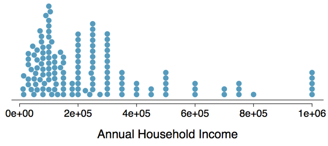
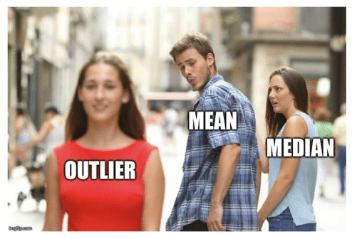
EXTREME OBSERVATIONS
How would sample statistics such as mean, median, standard deviation, and IQR of household income be affected if the largest value was replaced with $10 million? What if the smallest value was replaced by $10 million.
ROBUST STATISTICS
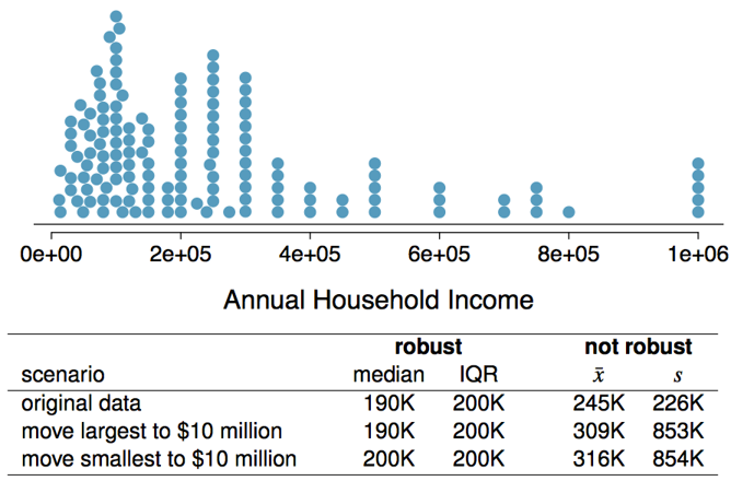
ROBUST STATISTICS
- The mean and variance/standard deviation are not robust to skewness or outliers - why?
The median and IQR are robust to skewness or outliers - why?
- For symmetric distributions, it is often helpful to use the mean and standard deviation to describe center and spread.
For skewed distributions, the median and IQR are often more helpful to describe center and spread.
PRACTICE
If you would like to estimate the typical household income for a student, would you be more interested in the mean or median income?
PRACTICE
If you would like to estimate the typical household income for a student, would you be more interested in the mean or median income?
Median
PRACTICE
Which is most likely true for the distribution of percentage of time actually spent taking notes in class versus on Facebook, Twitter, etc.?
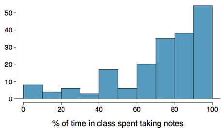
(a) mean \(>\) median; (b) mean \(\sim\) median; (c) mean \(<\) median; (d) impossible to tell
CONSIDERING CATEGORICAL DATA
MOTIVATING EXAMPLE
Vaccinate for Smallpox? (Boston 1721)
In 1721, a smallpox epidemic broke out in colonial Boston after ship arrived from London bearing an infected sailor. 6,224 people were exposed and 850 people died. The idea of inoculating (vaccinating) individuals against a disease was new at the time, and controversial. Doctors believed that inoculation (exposure to a disease in a controlled form) against smallpox could reduce the likelihood of death.
We have access to the data from this epidemic through the OpenIntro website (100 Data Sets). We will use this data to explore methods for summarizing categorical data.
MOTIVATING EXAMPLE
Smallpox epidemic, Boston 1721
'data.frame':   6224 obs. of  2 variables:
 $ result    : Factor w/ 2 levels "died","lived": 2 2 2 2 2 2 2 2 2 2 ...
 $ inoculated: Factor w/ 2 levels "no","yes": 2 2 2 2 2 2 2 2 2 2 ...
Give the variable names and types in this data set:
How many levels does each variable have and what are they?
MOTIVATING EXAMPLE
Smallpox epidemic, Boston 1721
'data.frame':   6224 obs. of  2 variables:
 $ result    : Factor w/ 2 levels "died","lived": 2 2 2 2 2 2 2 2 2 2 ...
 $ inoculated: Factor w/ 2 levels "no","yes": 2 2 2 2 2 2 2 2 2 2 ...
Give the variable names and types in this data set:
- Result: categorical (nominal)
- Inoculated: categorical (nominal)
How many levels does each variable have and what are they?
- Result: 2 levels, “died” and “lived”
- Inoculated: 2 levels, “no” and “yes”
CONTINGENCY TABLES
When we have two categorical variables (that we think are related), it is useful to organize the observations so that we can evaluate the potential relationship:
Smallpox epidemic, Boston 1721
          Result
Inoculated died lived  Sum
       no   844  5136 5980
       yes    6   238  244
       Sum  850  5374 6224
This is an example of a contingency table, which is a table that summarizes data for two categorical variables by organizing them by their factor levels.
BAR PLOTS
A bar plot is a common way to display a single categorical variable. A bar plot where proportions instead of frequencies are shown is called a relative frequency bar plot.

BAR PLOTS VERSUS HISTOGRAMS
How are bar plots different than histograms?
BAR PLOTS VERSUS HISTOGRAMS
How are bar plots different than histograms?
Bar plots are used for displaying distributions of categorical variables, while histograms are used for numerical variables. The x-axis in a histogram is a number line, hence the order of the bars cannot be changed, while in a bar plot the categories can be listed in any order (though some orderings make more sense than others, especially for ordinal variables.)
CHOOSING THE APPROPRIATE PROPORTION
Does there appear to be a relationship between inoculated (yes/no) and result (died/lived)?
          Result
Inoculated died lived  Sum
       no   844  5136 5980
       yes    6   238  244
       Sum  850  5374 6224
To answer the question, we examine the row proportions:
% not inoculated who lived: 5136/5980=0.86
% inoculated who lived: 238/244=0.97
BAR PLOTS WITH TWO VARIABLES
Stacked bar plot: graphical display of contingency table information, for counts
Side-by-side bar plot: displays the same information by placing bars next to, instead of on top of, each other
Standardized stacked bar plot: graphical display of contingency table information, for proportions

MOSAIC PLOTS
Mosaic plot: visualization technique for contingency tables that allows us to see the relative group sizes of one (one variable mosaic plot) or two variables (two variable mosaic plot). Summary of cell counts in a contingency table; boxes proportional to cell frequencies.

SEGMENTED BAR AND MOSAIC PLOTS
What are the differences between the visualizations shown below?

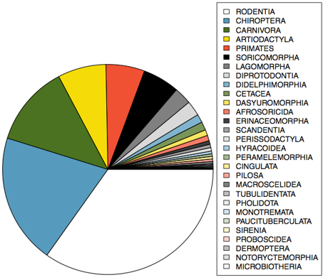
PIE CHARTS
A pie chart can be useful for providing a high-level overview to show how a set of cases break down, but it can be hard to make out details in a pie chart. For example:
REFERENCES
- Diez et al. (2019) OpenIntro Statistics, Fourth Edition